Jose Solano

Odyssey Design System
Okta is an identity and access management platform that helps organizations securely connect people to technology. To maintain consistency across its many products, Okta built Odyssey, a design system that provides shared components, patterns, and guidelines to ensure cohesive, accessible, and efficient product experiences.
Design Systems
Accessibility (a11y)
UI Design & Prototyping
ROLE
Senior Product Designer
TEAM
1 Product Designer
3 Engineers
1 Design Manager
3 Engineers
1 Design Manager
TIMELINE
2021 to 2023
WEBSITE
okta.com
Overview
I joined Okta’s Odyssey Design System team as the sole product designer, responsible for continuing to build, support, and evolve the system that ensures consistency across Okta’s product ecosystem. My work focused on refining and expanding Odyssey to better meet the needs of product teams at scale. As part of a small, cross-functional team, I collaborated closely with engineers and designers across the organization to strengthen Odyssey’s components, patterns, and overall design language.
The problem
Okta’s monolithic product architecture and fragmented design system history made it challenging to scale a unified design system efficiently. Multiple legacy design initiatives caused inconsistency and low trust among designers, while limited team resources and highly custom infrastructure slowed development and release cycles. The Odyssey team needed to stabilize the foundation, rebuild trust, and create a sustainable path for system growth.
Rebuilding for Speed and Sustainability
After auditing Okta’s product surfaces against Odyssey’s existing offering, it became clear that designers lacked the components and patterns they needed to build complete, consistent experiences. To close these gaps, the team decided to refactor Odyssey into a new version built on MUI, allowing us to expand coverage, simplify workflows, and deliver components faster to design teams.
This technical transition provided valuable breathing room to reassess foundational design principles, modernizing Odyssey’s design language to better support current product demands and prepare for an eventual brand redesign.
This technical transition provided valuable breathing room to reassess foundational design principles, modernizing Odyssey’s design language to better support current product demands and prepare for an eventual brand redesign.
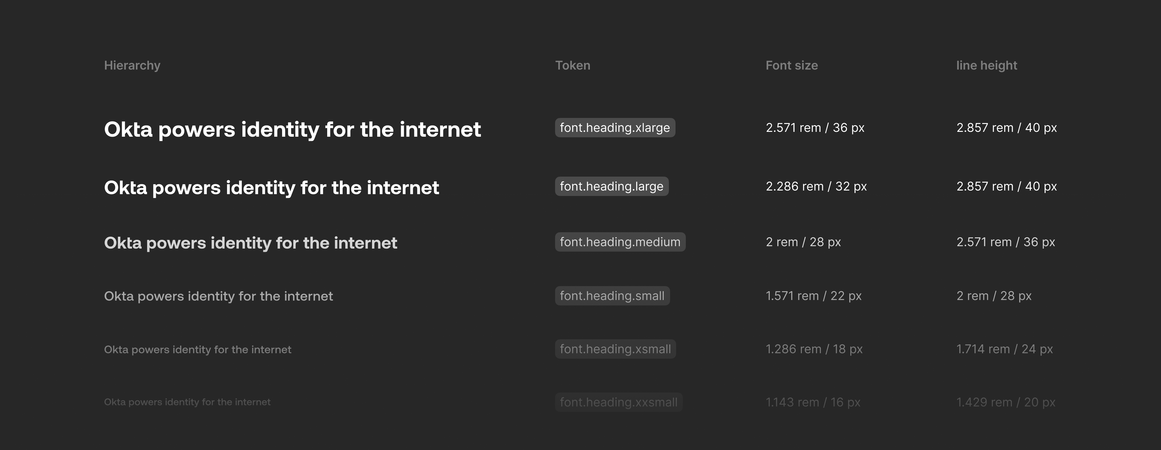
Typography
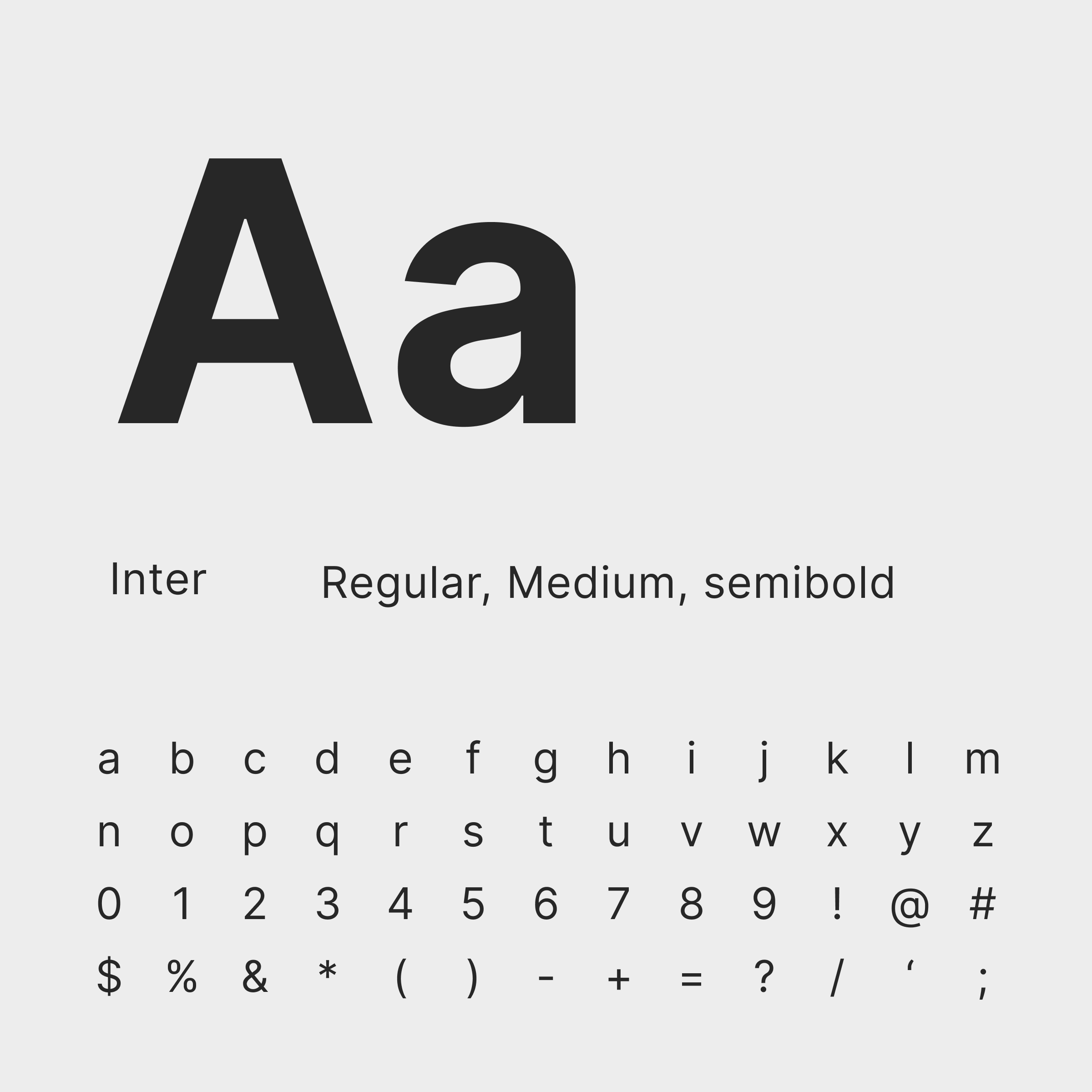
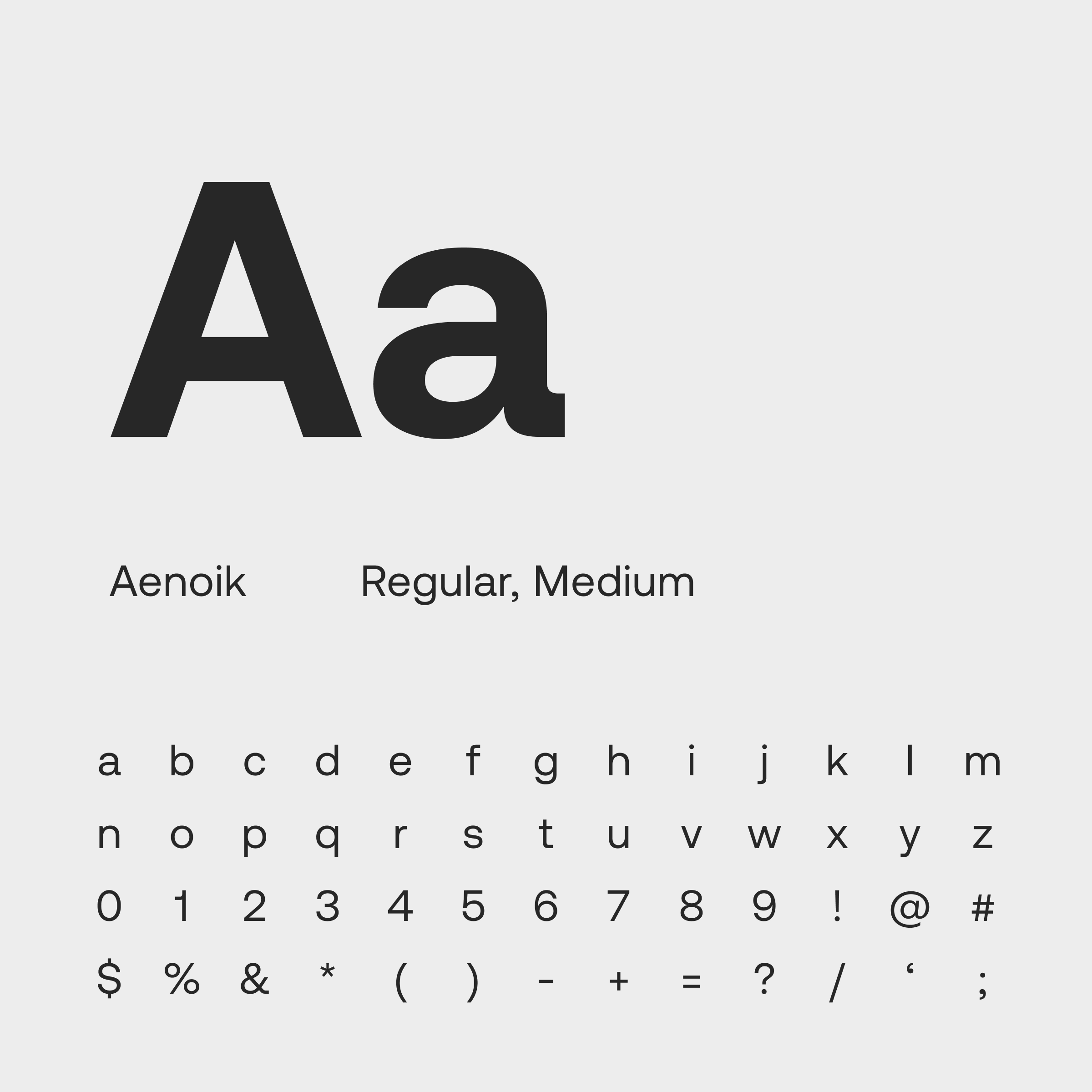
While the Okta brand redesign introduced Aeonik as its primary typeface, I recognized the need for a more neutral and flexible font stack within the product experience. To achieve this, we selected Inter, an open-source typeface known for its wide language support, excellent readability, and versatility across digital interfaces. Inter was used for body text and UI elements, while Aeonik remained reserved for headings and more expressive brand moments, creating a balanced relationship between functionality and brand expression.
The product typography follows a major second scale and aligns to an 8px baseline grid, providing a clear hierarchy and consistent rhythm throughout the interface. This approach gives designers predictable, harmonious type ratios while maintaining flexibility for complex layouts.
The product typography follows a major second scale and aligns to an 8px baseline grid, providing a clear hierarchy and consistent rhythm throughout the interface. This approach gives designers predictable, harmonious type ratios while maintaining flexibility for complex layouts.

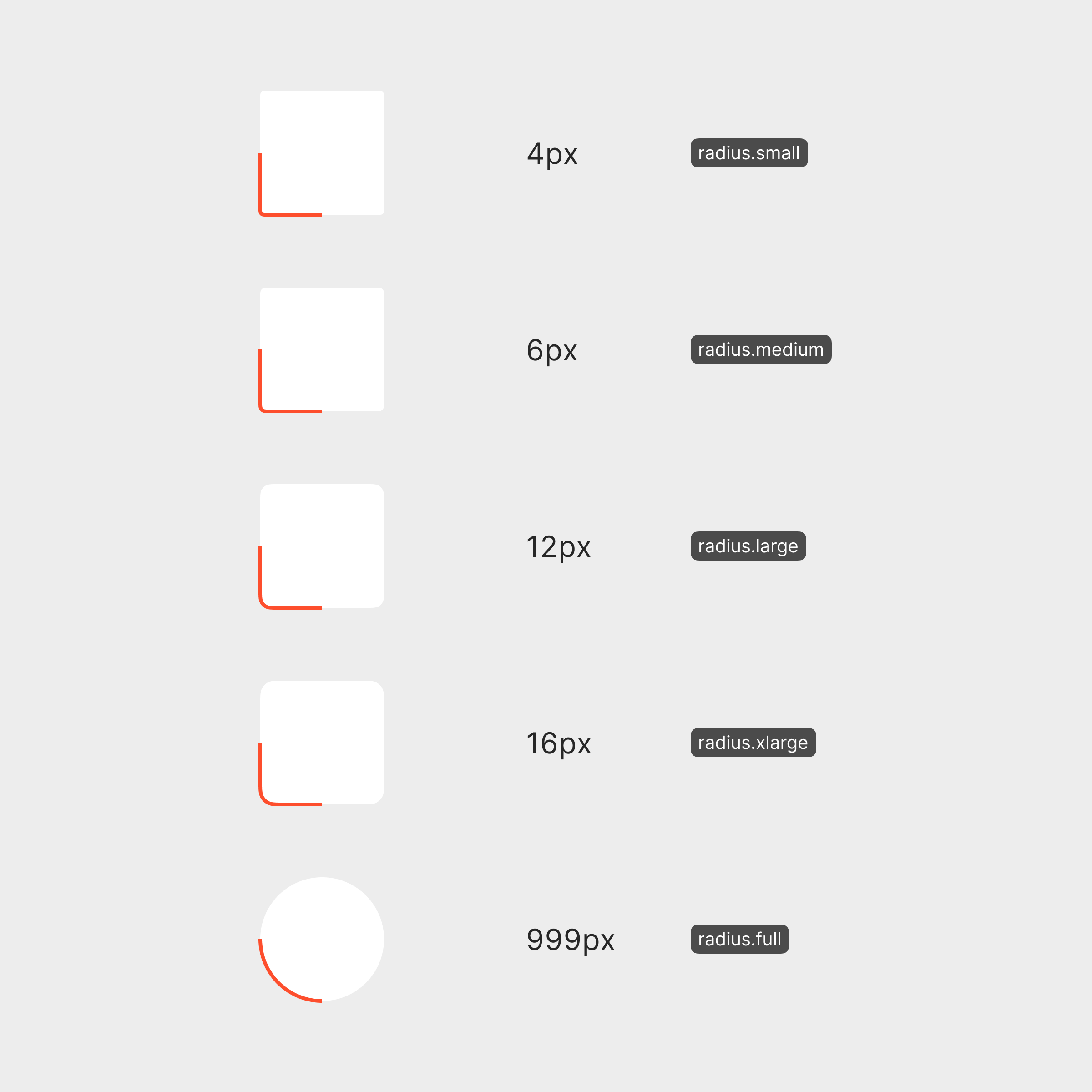
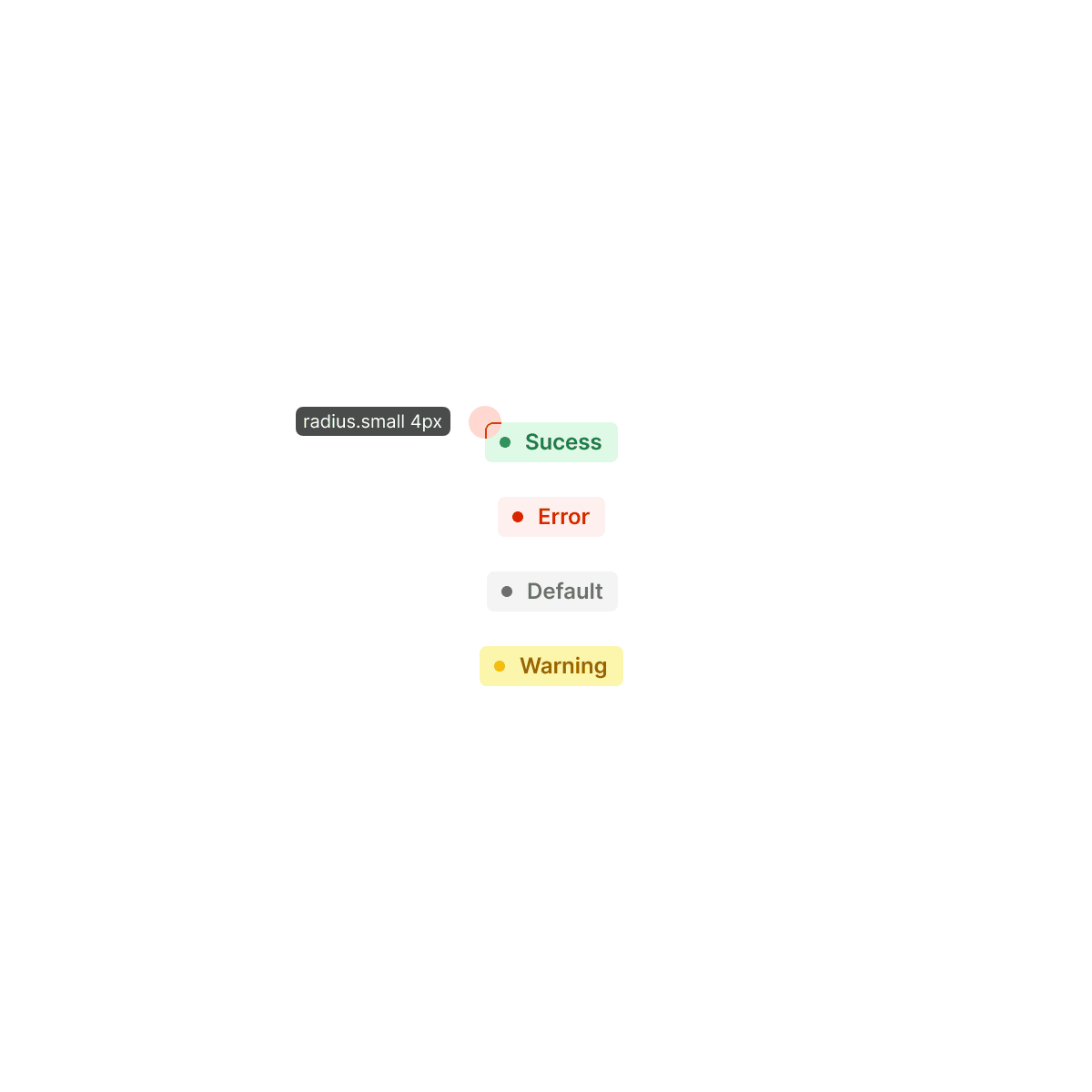
Radius
As part of modernizing Odyssey’s visual language, we introduced softer, rounder corner radii across components. The previous system relied on sharper edges that conveyed a more rigid, utility-driven aesthetic, which no longer reflected Okta’s evolving brand direction. By softening these shapes, the interface now feels more approachable and contemporary, while still maintaining the structure and clarity expected from an enterprise product.
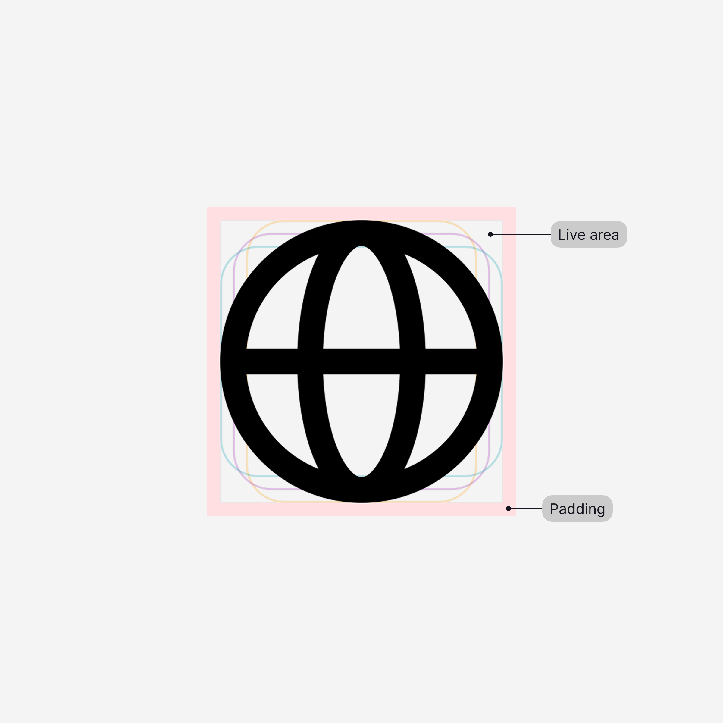
Icons
Partnering with the Visual Design team, we set out to simplify Odyssey’s icon library to make it more flexible and scalable. Our goal was to design icons that could serve multiple uses rather than maintaining a large collection of hyper‑specific assets. This shift reduced redundancy, improved consistency, and made the library easier to maintain.
I contributed by defining sizing and spacing guidelines to ensure icons aligned seamlessly with the overall system grid and typography. These adjustments helped the iconography feel balanced and cohesive within components, while maintaining clarity and usability across different interface sizes.
I contributed by defining sizing and spacing guidelines to ensure icons aligned seamlessly with the overall system grid and typography. These adjustments helped the iconography feel balanced and cohesive within components, while maintaining clarity and usability across different interface sizes.
Spacing
The spacing system is built on an 8px base unit, providing a harmonious and consistent foundation across all components. This structure simplifies alignment and ensures visual balance, whether in dense data views or more spacious layouts. The system was intentionally designed to give designers flexibility — allowing them to adjust UI density while maintaining overall consistency and rhythm. By standardizing spacing through tokens and predictable increments, the design language feels cohesive across varied use cases and product surfaces.
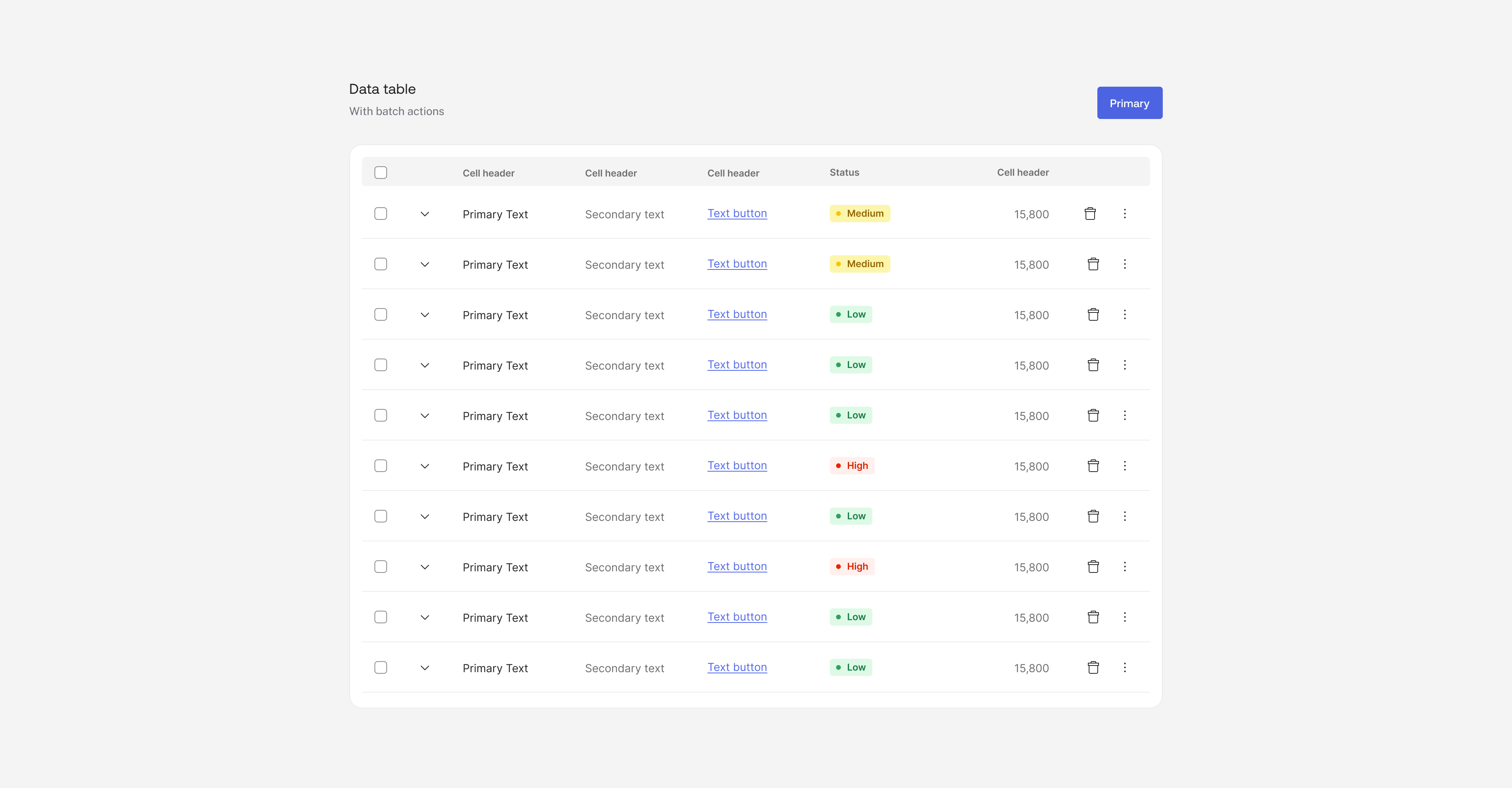
Components
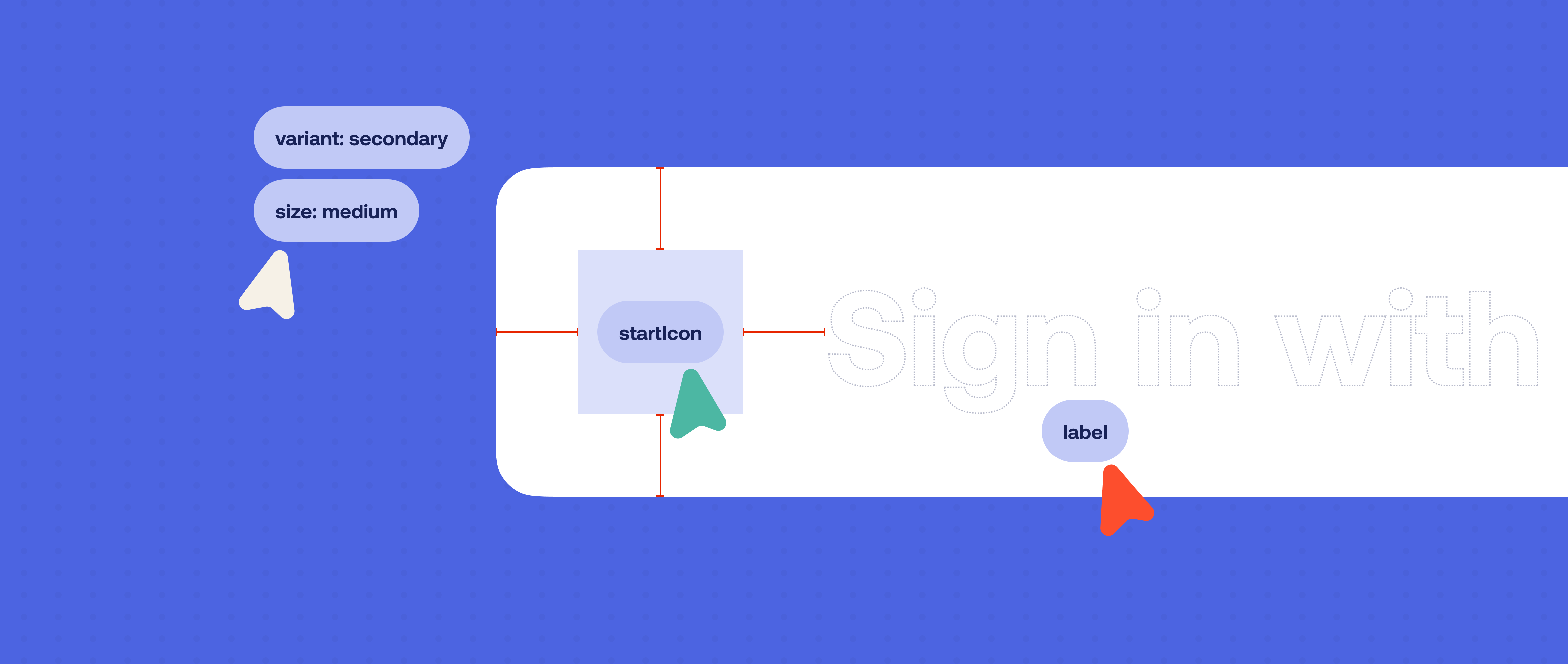
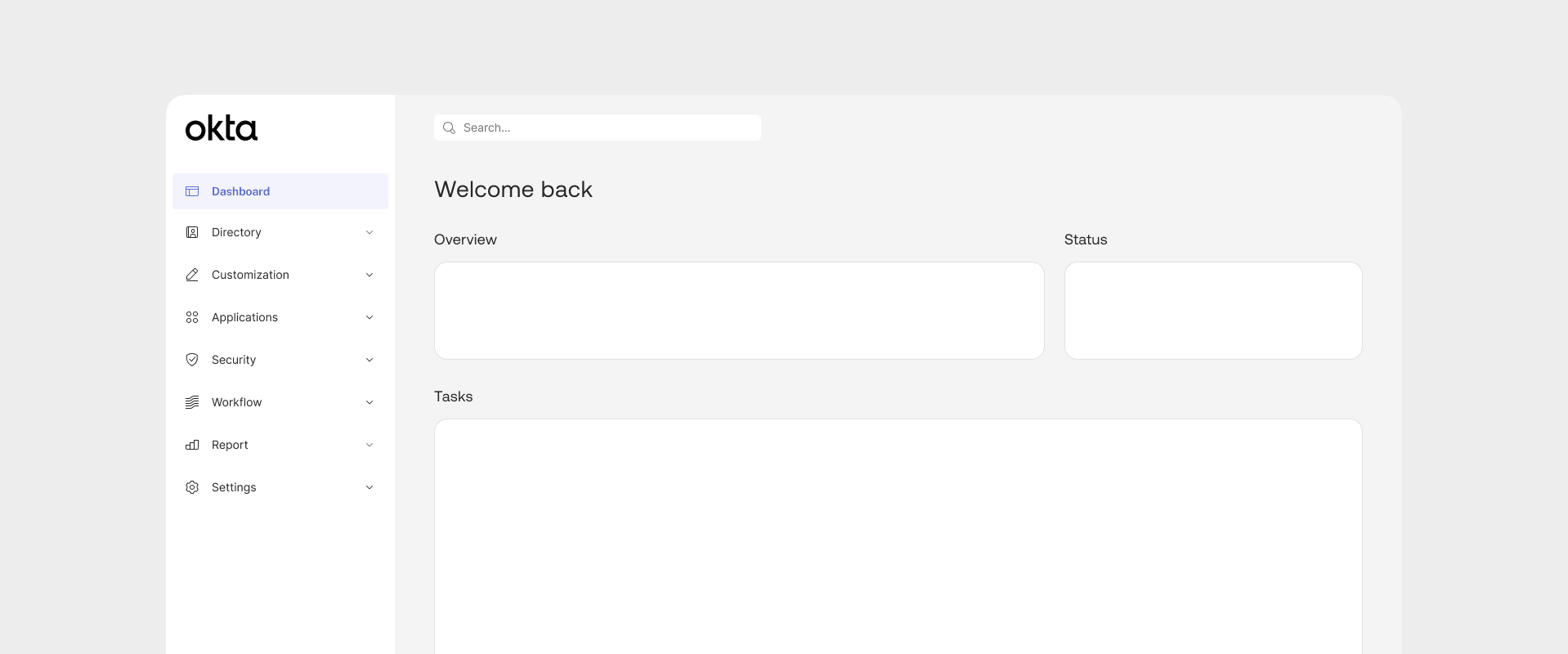
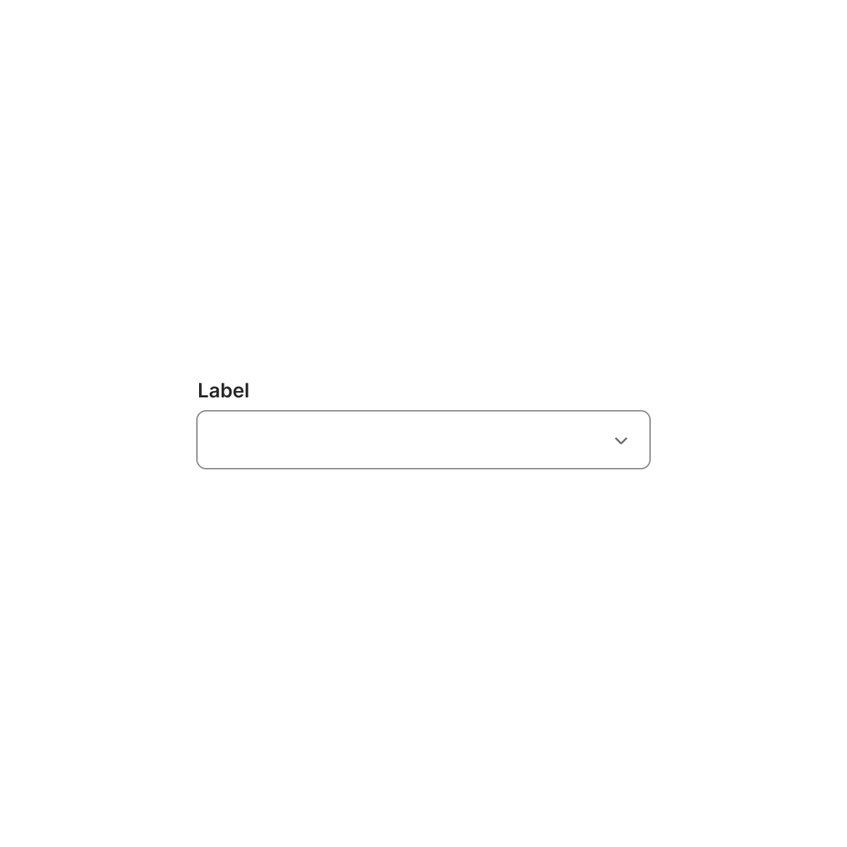
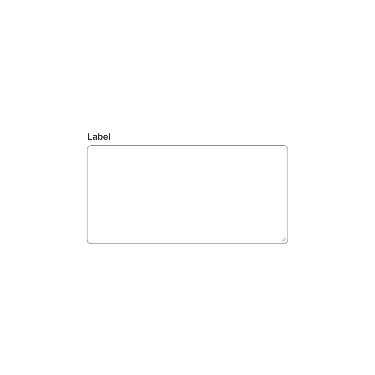
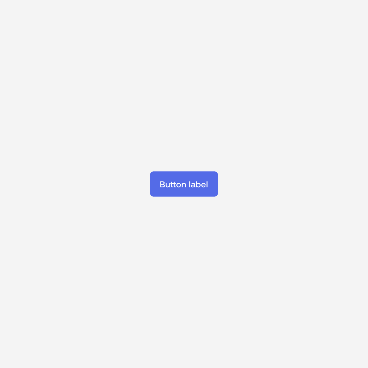
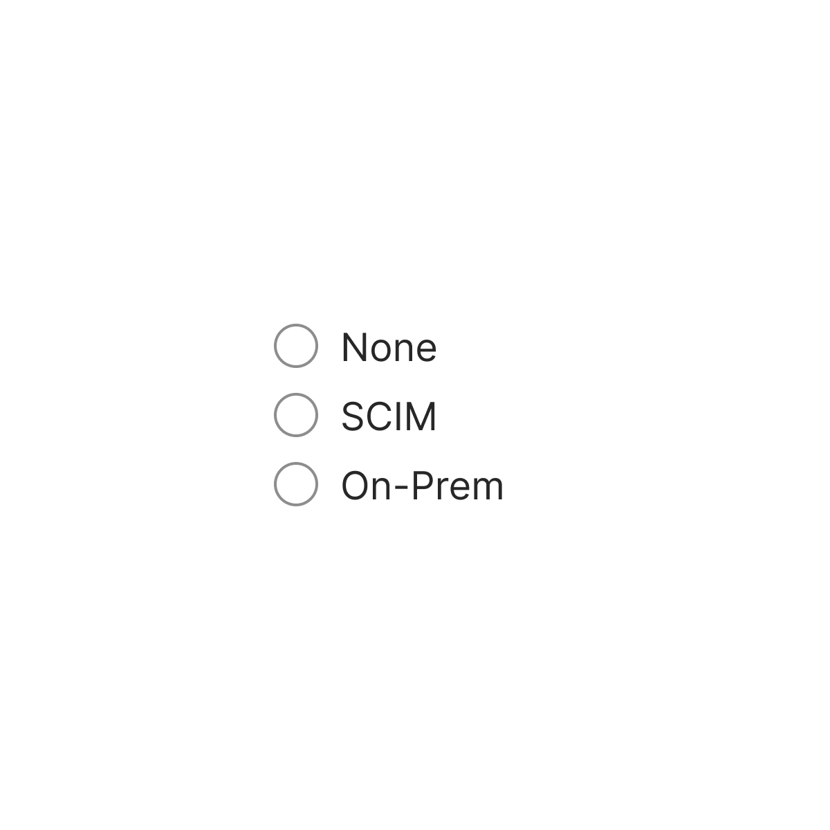
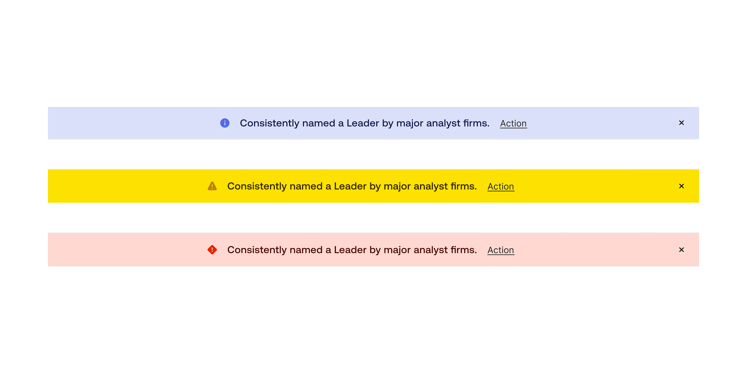
My role involved designing new components and refactoring existing ones to help designers solve a broad range of UI challenges more efficiently. Each component was built with flexibility and reusability in mind, ensuring that they could adapt to different product needs while maintaining visual and behavioral consistency.
All components were designed to work harmoniously within Okta’s product ecosystem, creating a cohesive user experience across complex interfaces. By standardizing patterns and strengthening component relationships, Odyssey empowered product teams to design and build with greater speed and confidence.
All components were designed to work harmoniously within Okta’s product ecosystem, creating a cohesive user experience across complex interfaces. By standardizing patterns and strengthening component relationships, Odyssey empowered product teams to design and build with greater speed and confidence.


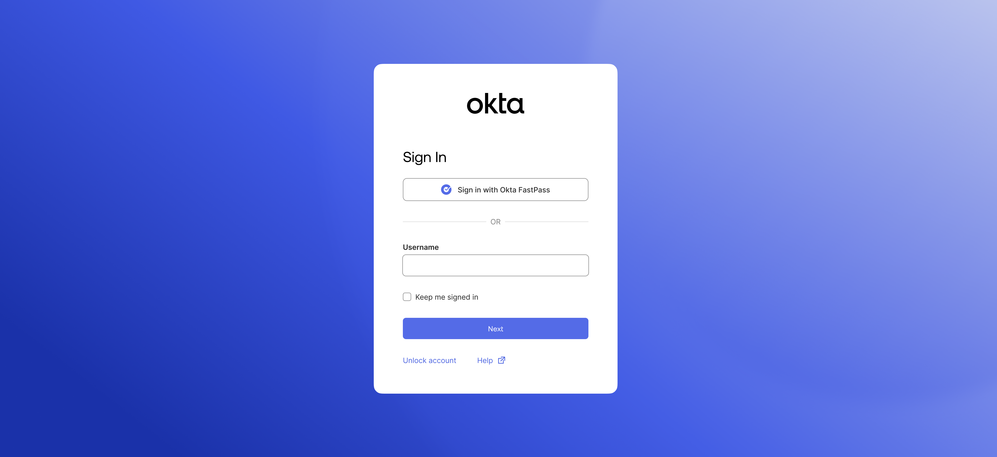
Strategic parternships
Given Okta’s scale and technical complexity, it wasn’t realistic to expect every product team to adopt Odyssey immediately. Instead, I worked to identify and partner with teams that were already rebuilding or modernizing their products — groups best positioned to benefit from and contribute to the design system early on. This approach allowed us to demonstrate value through real use cases and gather actionable feedback to refine the system further.
One of the first key partnerships was with the Sign-In Widget team, which successfully integrated Odyssey components into their rebuild. This collaboration became a proof point for how Odyssey could accelerate development, improve consistency, and serve as the foundation for modernizing Okta’s broader product ecosystem.
One of the first key partnerships was with the Sign-In Widget team, which successfully integrated Odyssey components into their rebuild. This collaboration became a proof point for how Odyssey could accelerate development, improve consistency, and serve as the foundation for modernizing Okta’s broader product ecosystem.
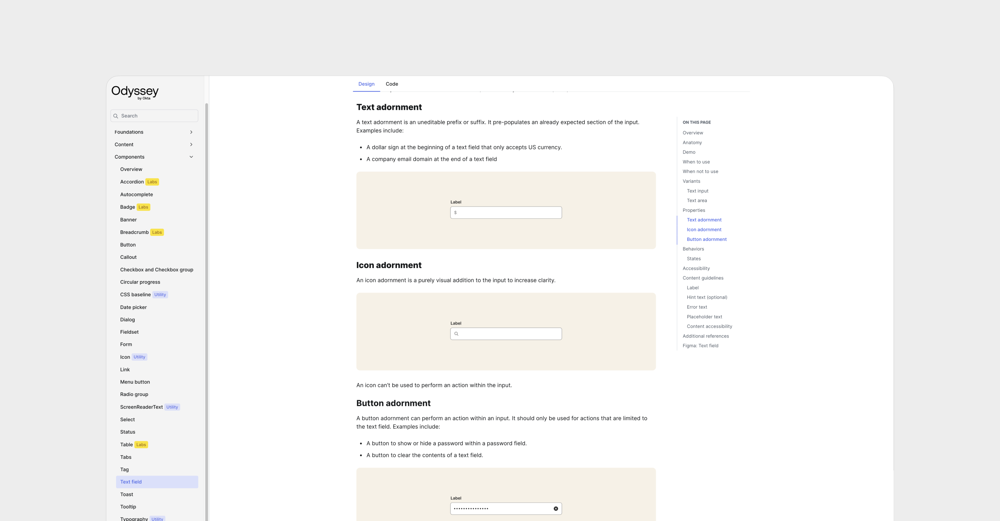
Documentation
Once Odyssey had gained enough traction across teams, we set out to build a comprehensive documentation site to support product designers, engineers, content designers, and other contributors. The goal was to make it easier for anyone building within Okta to understand how to use Odyssey effectively and apply it consistently.In collaboration with content designers, I wrote detailed component guidelines and specifications that outlined usage, behavior, accessibility standards, and implementation details.