Jose Solano

Stitchflow
Stitchflow gives IT teams the ability to reconcile and manage all their SaaS applications in one place, helping them eliminate duplicate tools, optimize license usage, ensure compliance, and maintain full oversight across the organization’s software stack.
0→1 Product Design
UX Research & Interviews
UI Design & Prototyping
Design System
Systems Thinking

ROLE
Staff Product Designer
TEAM
1 Project Manager
5 Engineers
1 Product Designer
5 Engineers
1 Product Designer
TIMELINE
2023 to 2025
WEBSITE
stitchflow.com
Overview
I joined Stitchflow as the founding designer in 2023, when the idea was little more than a sketch on a whiteboard. Over the next couple of years, I helped shape the product’s vision, design its foundation, and bring our first version to market, turning an early concept into something real and usable.
The problem
IT teams often struggle with tool fragmentation, where critical but complex data is scattered across multiple platforms. Each tool holds valuable information essential to their work, yet accessing and tracking this data across separate systems is time-consuming and prone to errors.
Making sense of SaaS sprawl through a unified user and access model
As the lead product designer, I shaped the overall structure of the app around SaaS applications and user access so everything could be tracked in one place, whether the data came from an identity provider, direct integrations, or manually uploaded CSVs. A normalized data model handled this complexity behind the scenes, translating shared concepts about users and their relationships to applications into a clear, consistent view of ownership, access, and risk.
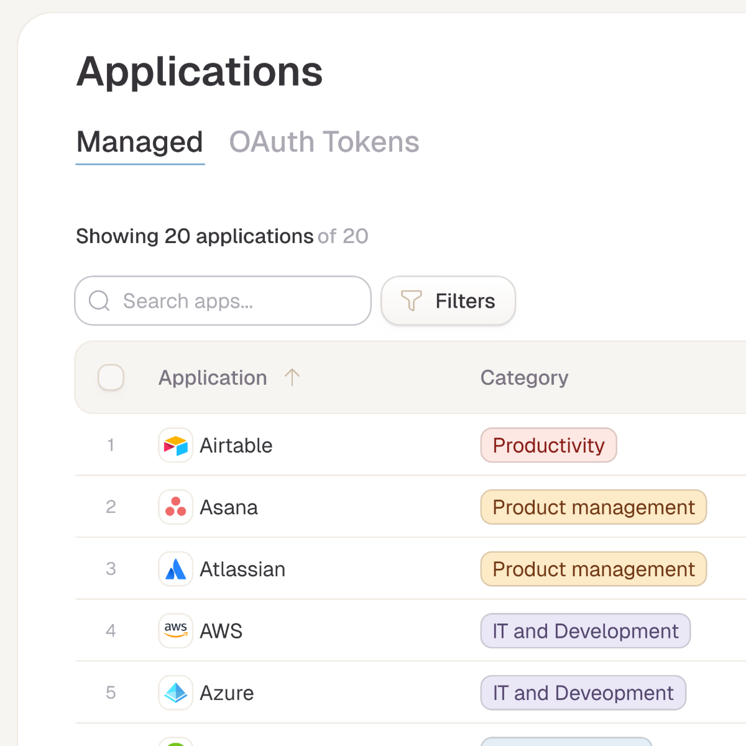
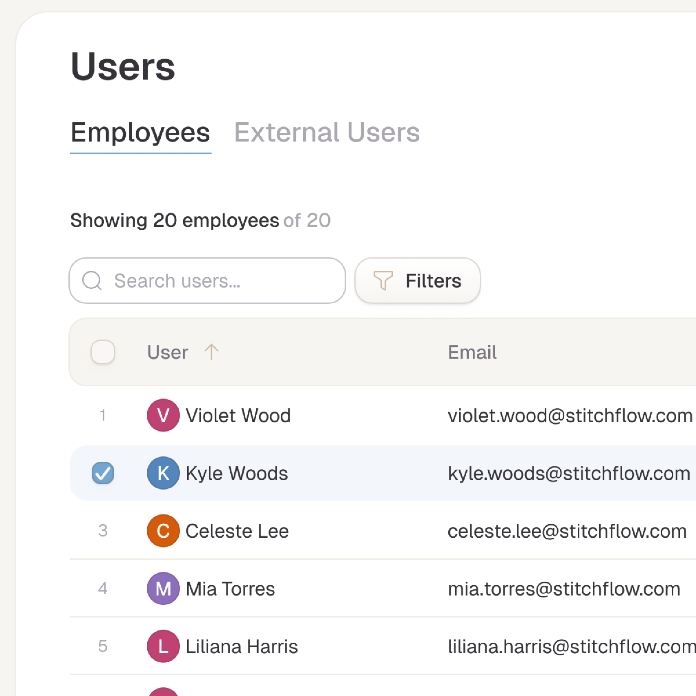

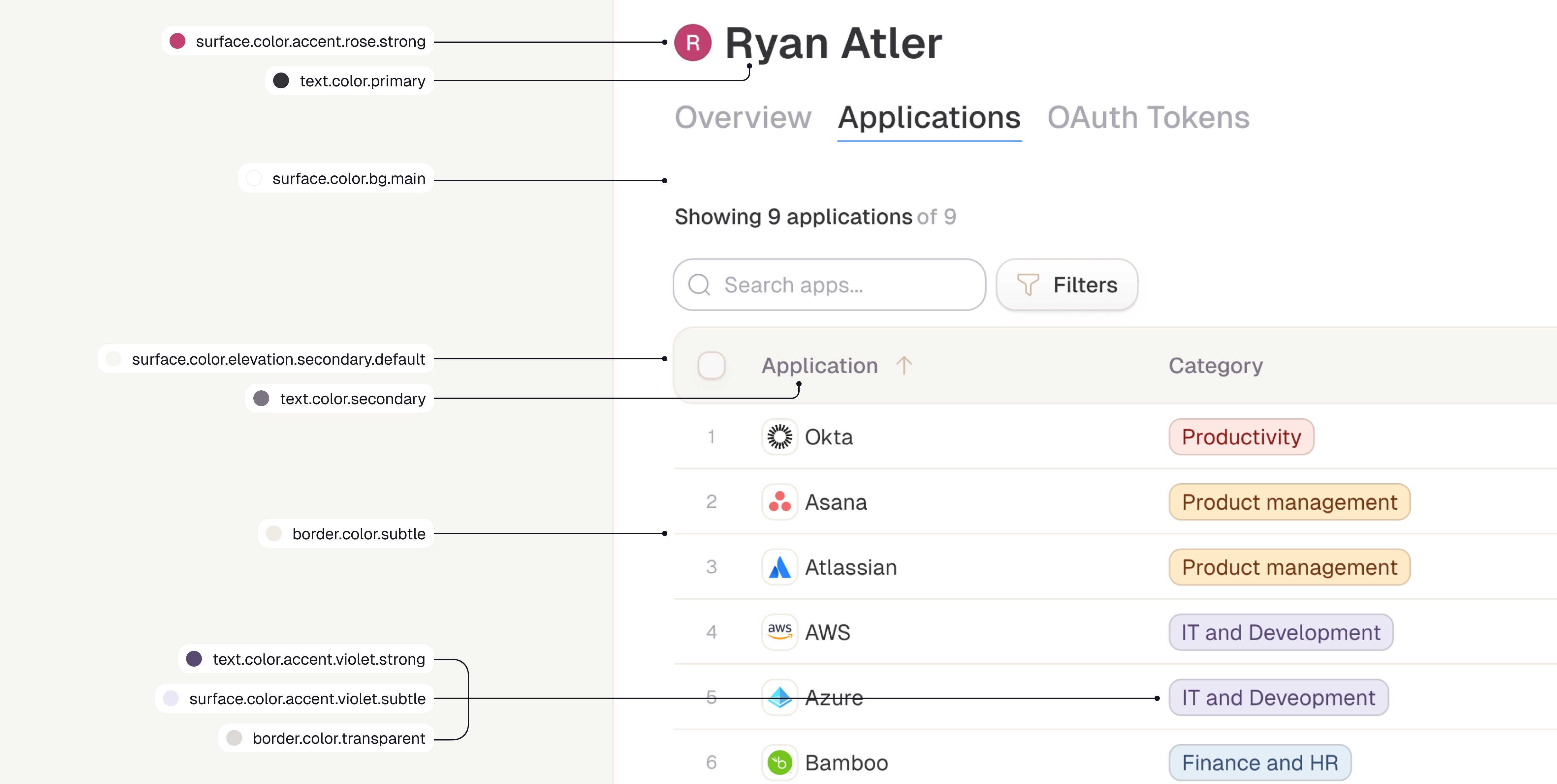
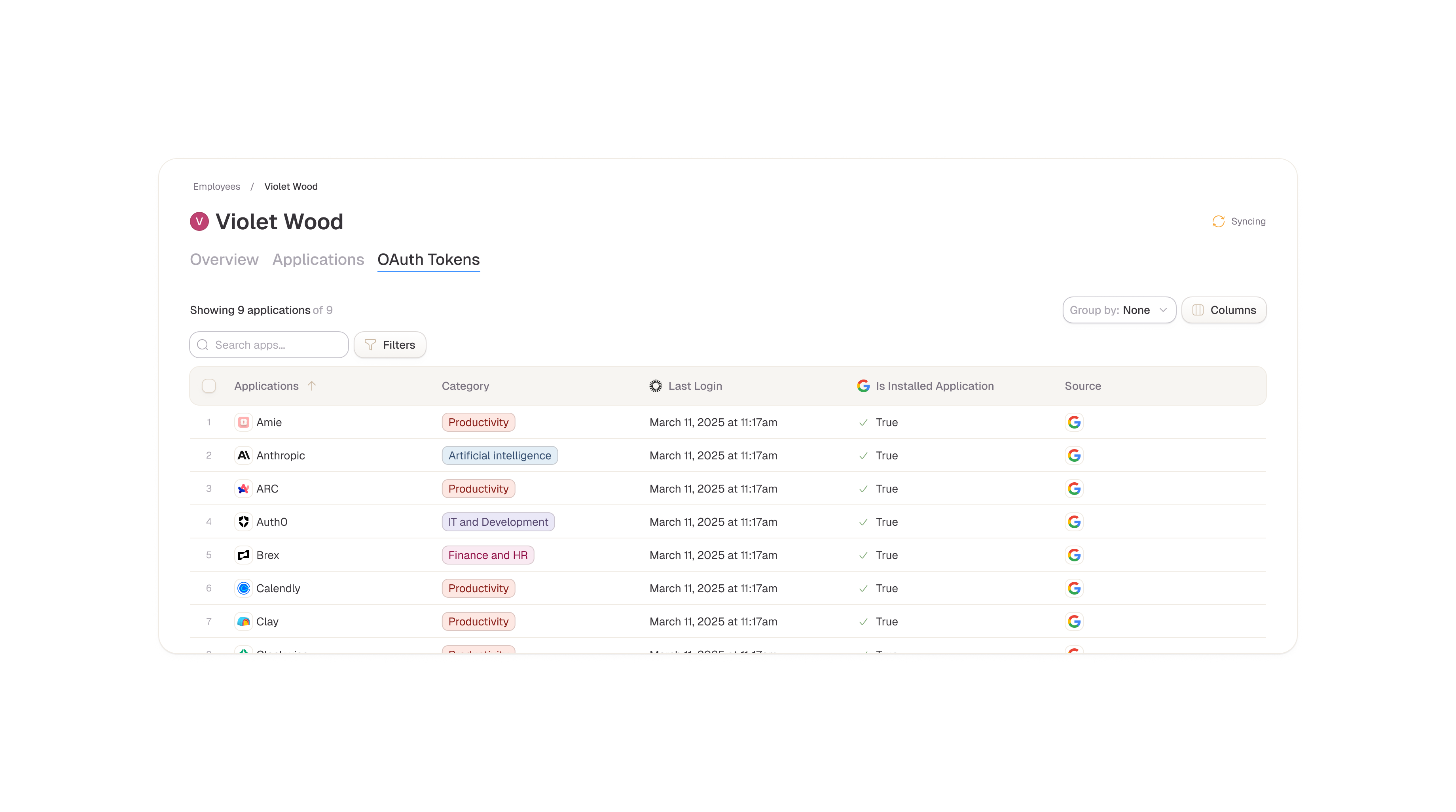
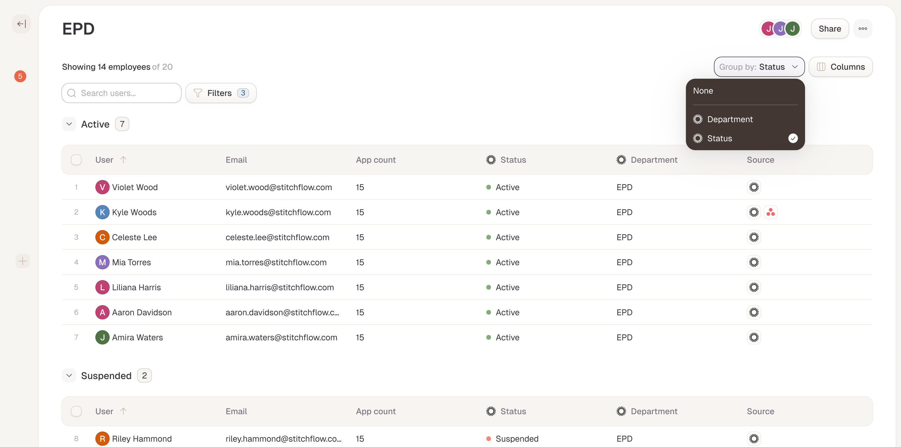
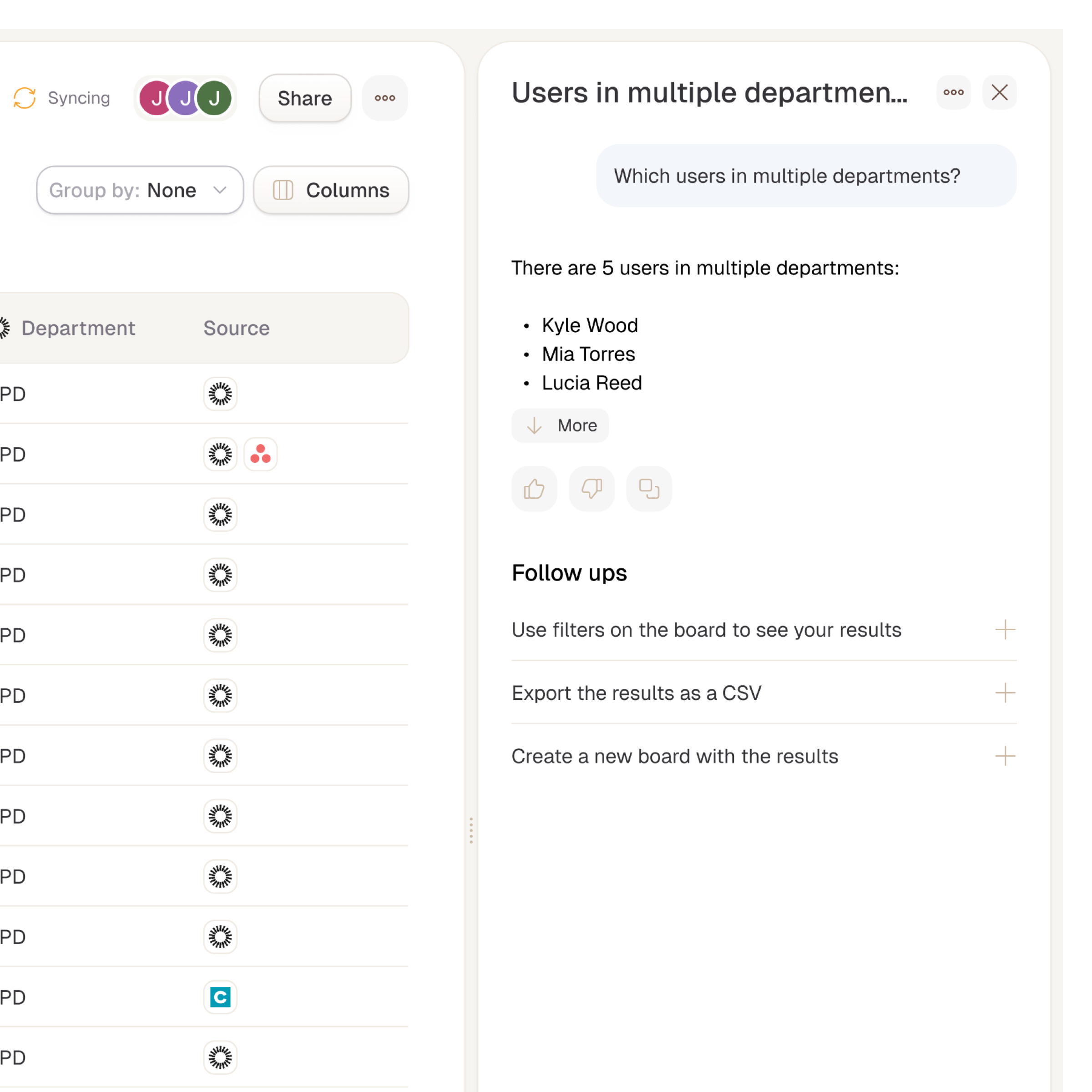
Drill-Down Views for Users and Apps
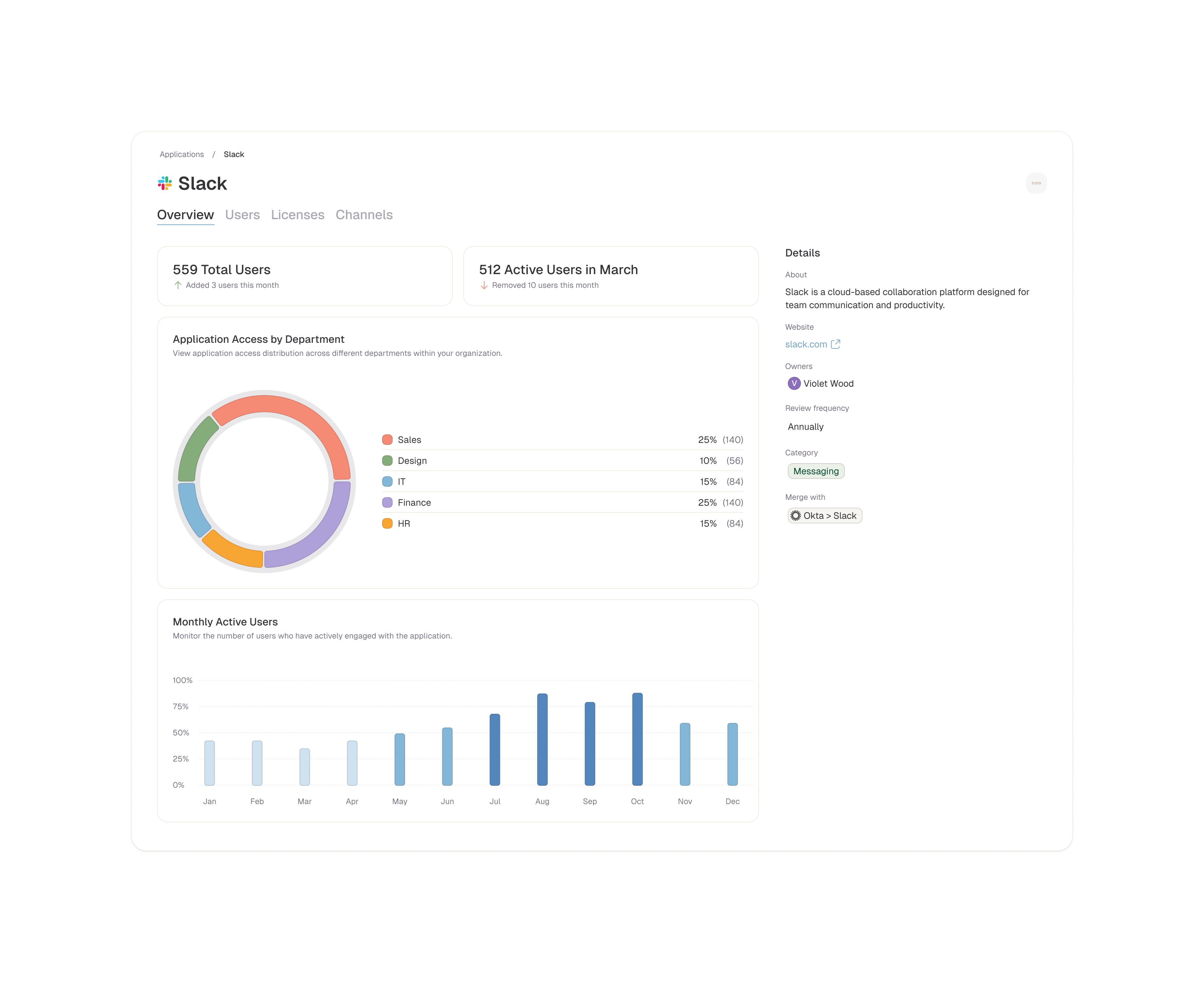
As part of the core experience, I designed a context layer on top of the user and SaaS views so people can quickly dive deeper into what matters for a specific user or application. When looking at a user, admins can review their access based on where they were discovered, such as identity providers, direct integrations, or manual uploads, and understand how that translates into effective access across apps. When looking at an application, they can see overall user access as well as additional, use‑case‑specific details, like Slack channels, workspaces, or license tiers. This context layer turns each user or app view into an actionable hub, connecting high‑level inventory with the underlying details needed to investigate, audit, or make changes.
Designing Extensible Data Layers
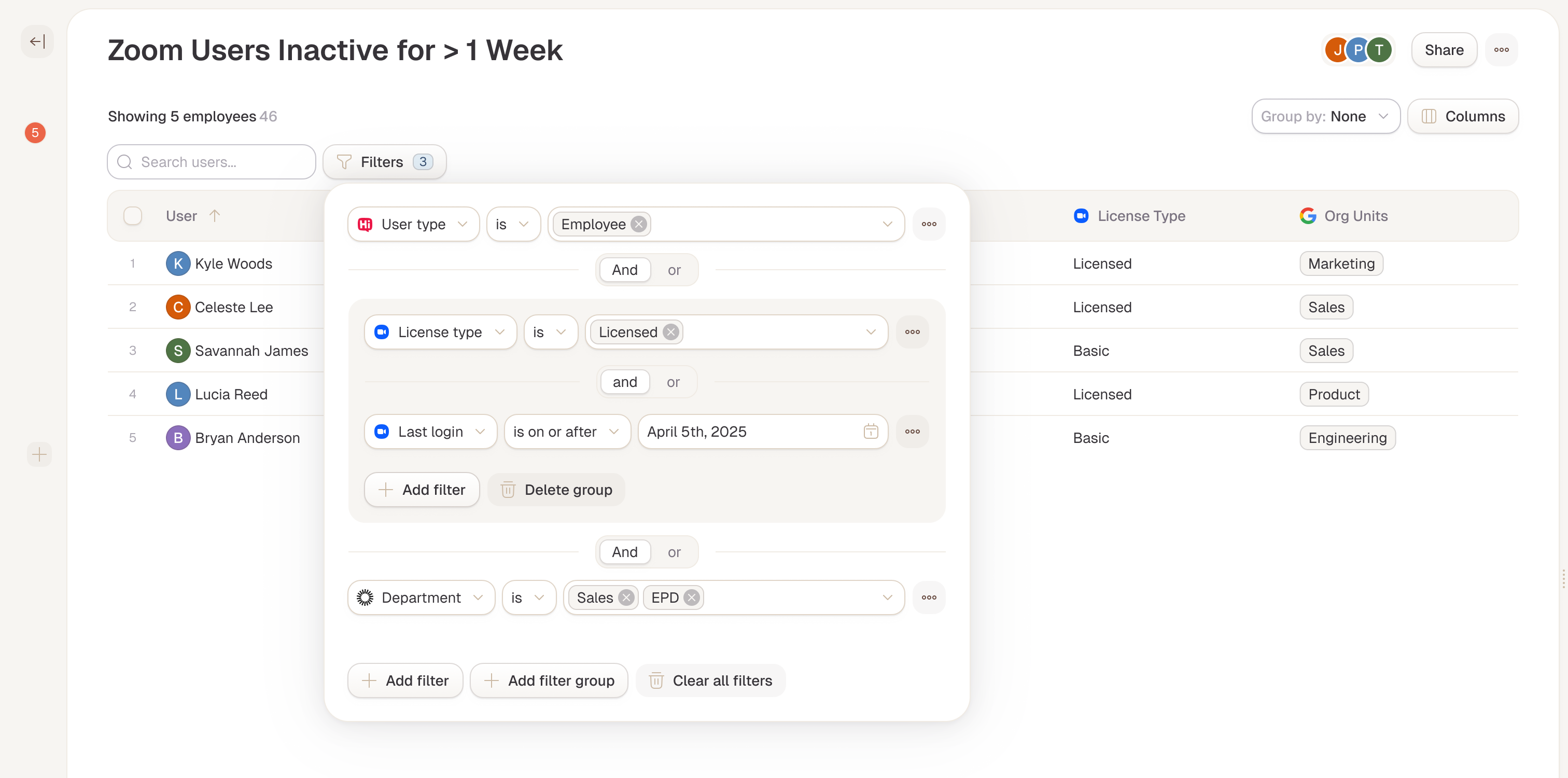
An extensible data layer on top of our core user and app views was designed to empower admins to build custom boards tailored to their org's unique workflows. These boards pull from any integration endpoint, like generating a Jamf-powered device tracker or a Freshservice ticket overview filtered by priority and SLA.
I designed an advanced filtering system that lets users slice data across HR systems, identity providers, and connected SaaS apps to zero in on critical gaps, quickly surfacing answers to complex access questions. This approach made the platform truly adaptable, balancing predefined structure with the flexibility to evolve alongside diverse IT and security needs
I designed an advanced filtering system that lets users slice data across HR systems, identity providers, and connected SaaS apps to zero in on critical gaps, quickly surfacing answers to complex access questions. This approach made the platform truly adaptable, balancing predefined structure with the flexibility to evolve alongside diverse IT and security needs
Enabling Stitchflow as Single Source of Truth
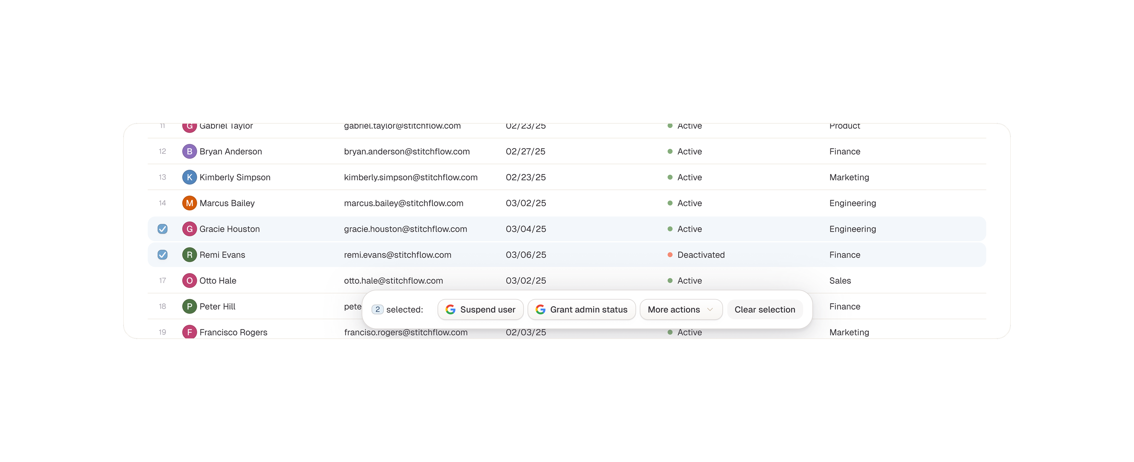
To position Stitchflow as the single source of truth for SaaS management, I designed a system that integrates third-party actions directly into the data exploration workflow. As admins investigate users, apps, or custom boards, they can trigger actions from external tools, like revoking access in Okta, updating tickets in ServiceNow, or offboarding in an HRIS without leaving the platform. This seamless embedding of workflows eliminates tool-switching, keeps context intact, and turns insights into immediate outcomes. By prioritizing these "act from anywhere" patterns, I ensured Stitchflow wasn't just a viewer of data, but the central hub for managing sprawl at scale.
Building a Future-Proof Design System
I built and managed the design system with Stitchflow's long-term vision front and center, creating a scalable foundation ready to grow from MVP to a mature platform. I set core principles of consistency, extensibility, and performance by defining reusable components and patterns for data dense pages like data tables, and filtering controls. These supported everything from predefined views to user-generated boards. Through iterative audits, cross-team workshops, I cut design debt, sped up engineering handoffs, and kept the experience cohesive as we added features. This approach made the design system a true strategic asset for fast iteration without losing polish or flexibility.
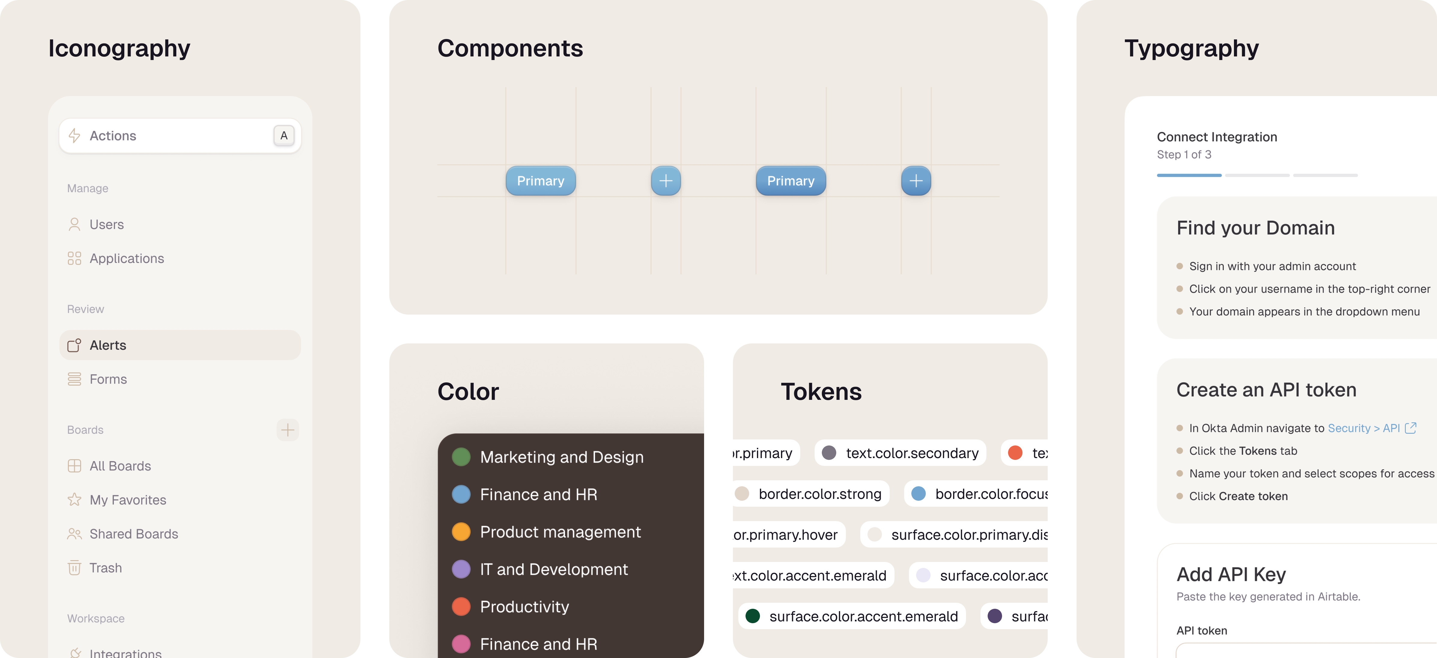
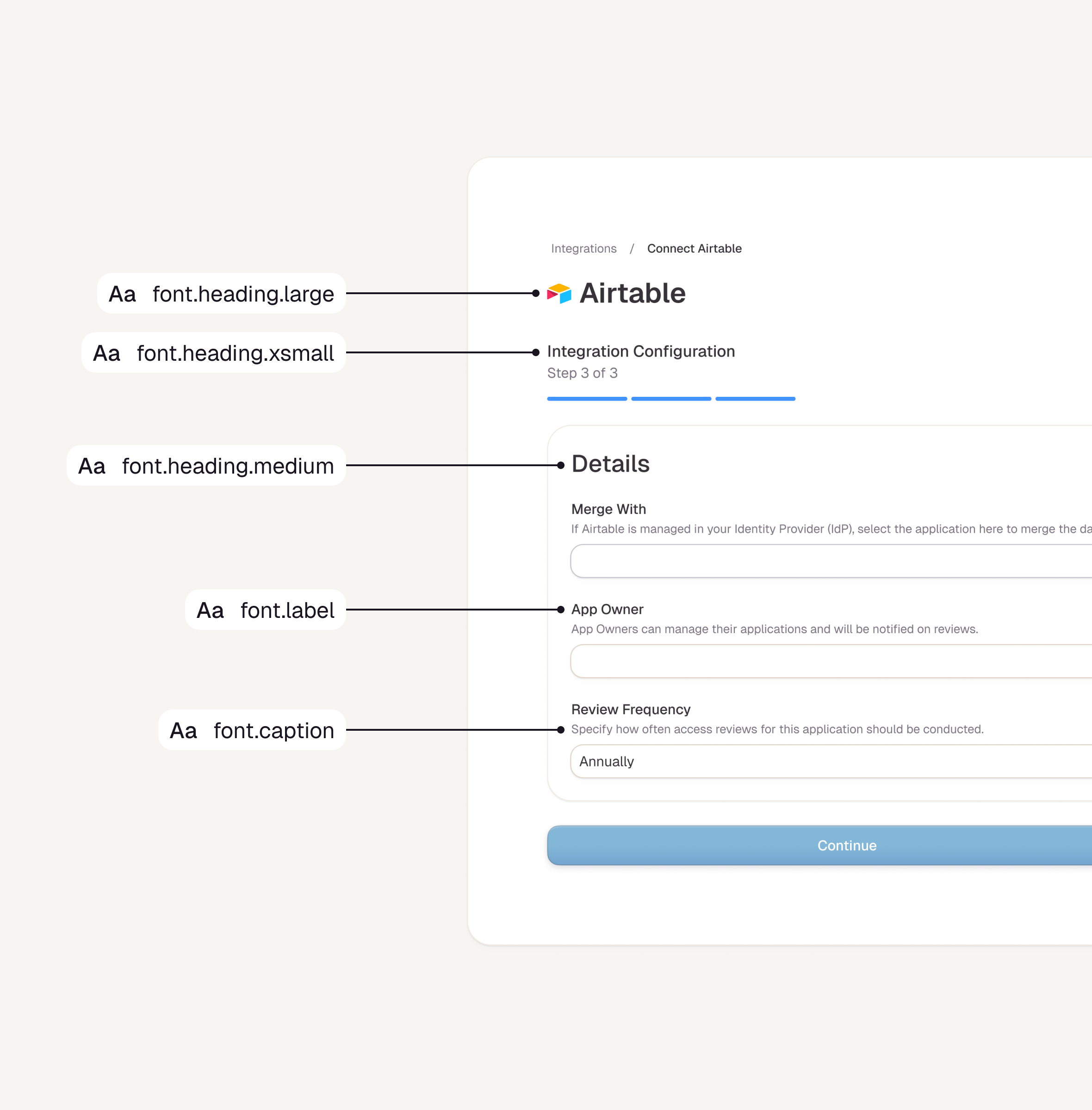
Typography & Spacing
I intentionally limited text styles to a focused set of options, with type tokens defining font family, size, and line height to ensure strong legibility and a consistent visual hierarchy across the design system. Every typography token uses rem units, empowering users to adjust scaling easily for better responsiveness and accessibility. This approach keeps the system simple yet flexible, supporting diverse needs from dense data tables to custom boards without compromising clarity.
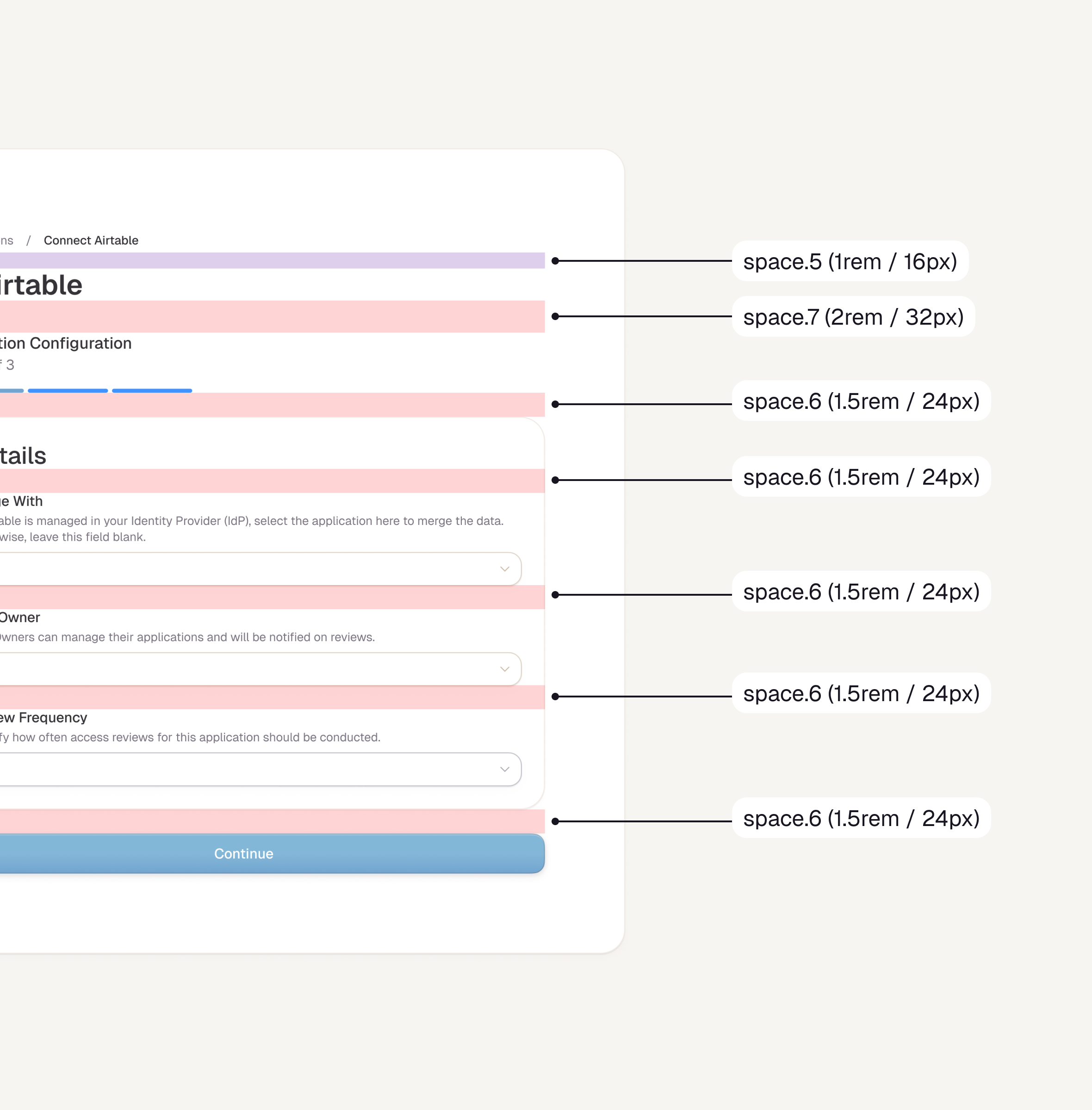
Complementing this, I designed the spacing scale around 8-pixel increments to create a consistent visual rhythm. This 8-point grid ensures spacing values align intuitively from tight gaps in data tables to generous padding on page layouts.
Complementing this, I designed the spacing scale around 8-pixel increments to create a consistent visual rhythm. This 8-point grid ensures spacing values align intuitively from tight gaps in data tables to generous padding on page layouts.
Iconography
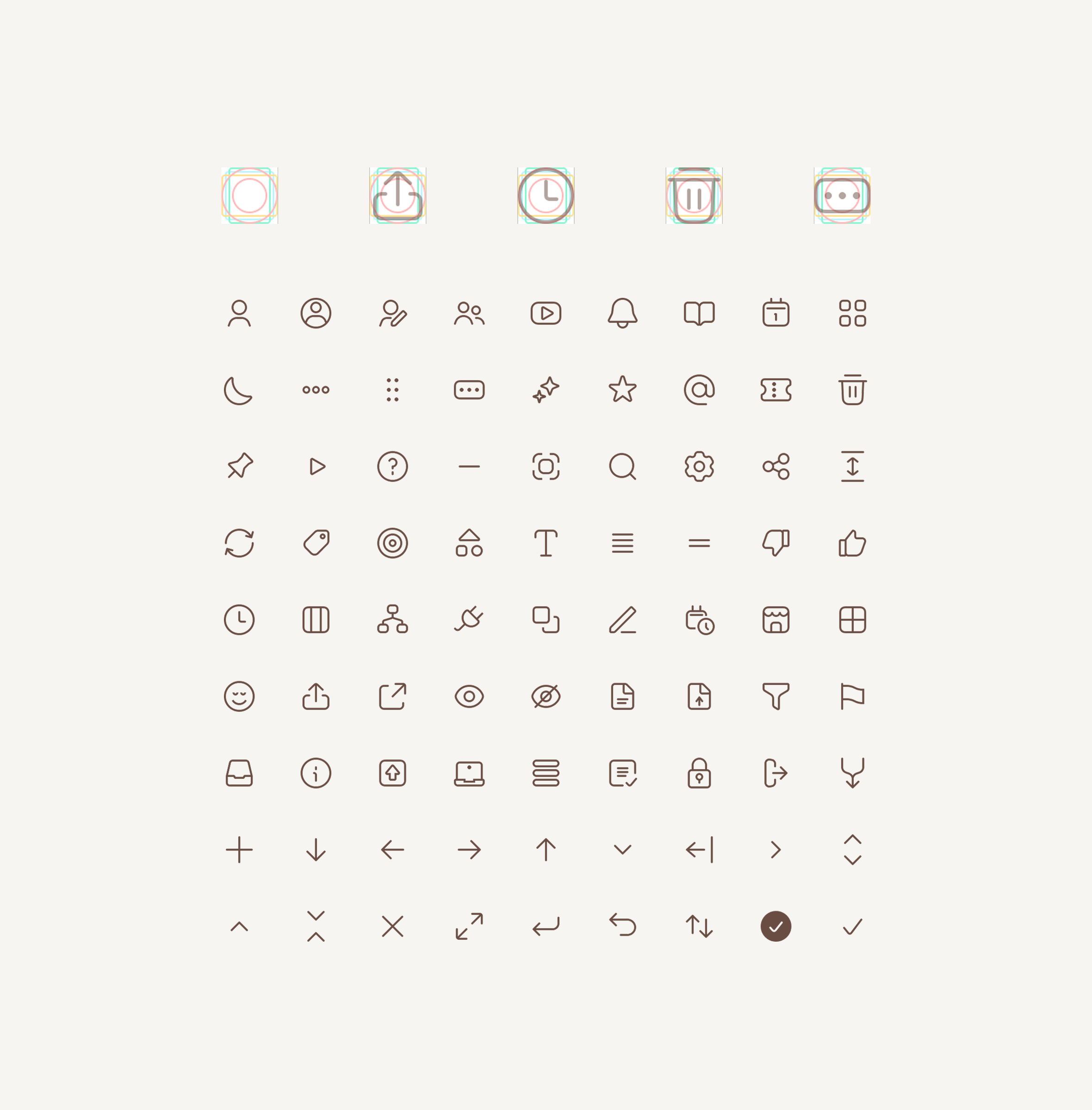
The icon system was custom designed to feel cohesive alongside typography and to be clear and intentional when used inside components. Each icon sits within a 16px bounding box and is drawn on a shared grid, so whether the shape is taller or wider, it maintains proper optical balance and alignment. This approach keeps icons legible at small sizes while supporting a consistent visual rhythm across the interface.
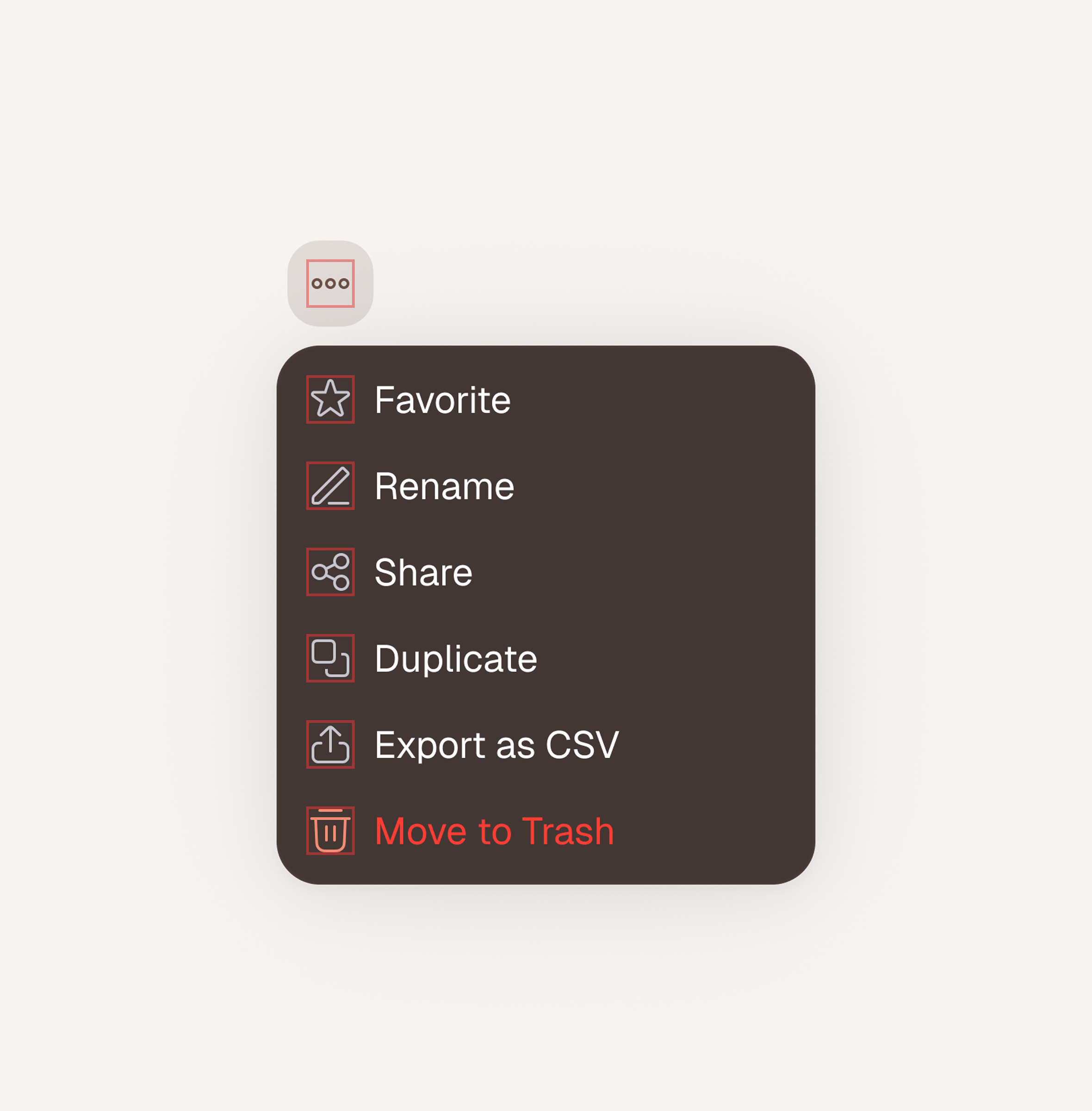
Color
The color system for Stitchflow is intentionally simple, using white space as the primary “color” so dense data grids remain easy to scan and highly legible. This neutral base is supported by a range of content grays and soft beige surfaces that add warmth, create gentle separation between regions, and preserve accessibility. Additional colors are used sparingly and with clear intent, reserved for communicating state, hierarchy, and urgency rather than decoration, so visual noise stays low and important signals stand out.